Wednesday, August 12, 2009

Finally they changed it

One of our favourite goaltenders has finally gotten the NHL to change the spelling of his name. And it's about time.

From the Caps Media Relations Blog,

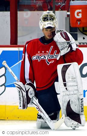
"Simeon Varlamov - in name only at least - is no longer a member of the Capitals. That is because the promising young goaltender from Russia has filed papers with the NHL to have his first name spelled S-E-M-Y-O-N for the upcoming season and foreseeable future.

However, name changes are nothing new to Varlamov. According to the NHL, when the Caps selected him 23rd overall in the 2006 NHL Draft his first name was spelled S-E-M-E-N. Papers were then filed with the league on behalf of the player to change the spelling of his first name to S-I-M-E-O-N prior to this latest change.

But for now, Semyon Varlamov should be used in all text and publications from this point forward."

First of all, who the heck had the smart idea of naming him Semen? That's absolutely ridiculous and quite insulting. And then they change it to Simeon? It has nothing to do with anything Russian. What were they thinking?
Oh wait that's right. They WEREN'T.
Because they definitely didn't ask him how he wanted his name spelled. He's wanted it Semyon for like ever but they just didn't listen did they.

Finally our brotha from anotha motha has people spelling his English name correctly. And saying it right.
After all, he will be a Stanley Cup Champion this season. He's that freaking amazing.


http://americansportsblog.files.wordpress.com/2009/06/the-stanley-cup.jpg

That's right, Semyon. It's ours.

http://www.peoples.ru/sport/hockey/semen_varlamov/varlamov-10082008185641THO.jpg

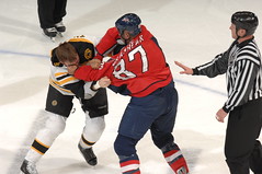
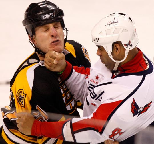
Don't worry, summer's almost over. Hockey will be back soon. Meanwhile, I suggest you listen to Sirius XM Channel 204 NHL Home Ice. Like I have been doing all summer. It's a wonderful place that helps you remember moments like this


Also on the Caps Media blog, apparently "Alex Ovechkin was the answer to a trivia question on the popular ABC game show "Who Wants To Be A Millionaire" last night. The $50,000 question given to the contestant was, "Which of these men is the National Hockey League MVP this year and not a character in a Anton Chekhov play?" The contestant knew the answer to win $50,000. You can watch the full episode from last night on ABC's website." That's not a $50,000 question to me but okay whatever. The other choices were Konstantin Treplev, Mikhail Astrov, Boris Trigorin.


The season will be here before you know it...

Tuesday, August 11, 2009

My Jersey Ranking

The Hockey News recently ranked all the NHL jerseys. I thought they got it wrong so I decided to rank them myself. I am a bit biased with some of them but all in all I thought I did a pretty good job.

http://medias.thehockeynews.com/medias/jerseyrankings/NHL/13.jpg

#1 Washington Capitals

Most beautiful jerseys in the league. Also instill fear in the other teams. When they see it, they know to get the heck out of his way.

http://medias.thehockeynews.com/medias/jerseyrankings/NHL/22.jpg

#2 Carolina Hurricanes

I really like their logo. The pattern at the bottom is cool too.

http://medias.thehockeynews.com/medias/jerseyrankings/NHL/1.jpg

#3 Chicago Blackhawks

Simple design and the colors go together well. The logo on the shoulder is the best part.

http://medias.thehockeynews.com/medias/jerseyrankings/NHL/3.jpg

#4 Montreal Canadians

The Hockey News said “Might as well call that middle line the 'Habs stripe'” Couldn’t have said it better myself.

http://medias.thehockeynews.com/medias/jerseyrankings/NHL/2.jpg

#5 Boston Bruins

My school colors. How could I not love my school colors. The stripes on the bottom and arms are nice.

http://medias.thehockeynews.com/medias/jerseyrankings/NHL/4.jpg

#6 Detroit Red Wings

Very simple but still appealing. I also like the shade of red.

http://medias.thehockeynews.com/medias/jerseyrankings/NHL/9.jpg

#7 Toronto Maple Leafs

I like this shade of blue. This is also simple but very classic and appealing.

http://medias.thehockeynews.com/medias/jerseyrankings/NHL/10.jpg

#8 Calgary Flames

Great logo and colors. The design reflects the logo and it all goes together very well.

http://medias.thehockeynews.com/medias/jerseyrankings/NHL/11.jpg

#9 New Jersey Devils

Strong look and good colors.

http://medias.thehockeynews.com/medias/jerseyrankings/NHL/16.jpg

#10 San Jose Sharks

Great colors and logo. And mascot.

http://medias.thehockeynews.com/medias/jerseyrankings/NHL/28.jpg

#11 Tampa Bay Lightening

Very strong and good colors. Great logo as well. And I like the font but The Hockey News didn't.

http://medias.thehockeynews.com/medias/jerseyrankings/NHL/26.jpg

#12 Colorado Avalanche

Great colors and logo. Simple and clean. Love the blue lines at the top.

http://medias.thehockeynews.com/medias/jerseyrankings/NHL/6.jpg

#13 New York Rangers

Hate the Rags but their jersey’s not bad. I like the letters going diagonal.

http://medias.thehockeynews.com/medias/jerseyrankings/NHL/23.jpg

#14 Columbus Blue Jackets

The front and sides are a bit empty. And the logo is ehhh...Good colors though :)

http://medias.thehockeynews.com/medias/jerseyrankings/NHL/8.jpg

#15 St. Louis Blues

Too much blue but I like the yellow outlining.

http://medias.thehockeynews.com/medias/jerseyrankings/NHL/18.jpg

#16 Phoenix Coyotes

Good simple colors.

http://medias.thehockeynews.com/medias/jerseyrankings/NHL/20.jpg

#17 Vancouver Canucks

I agree with The Hockey News it is a bit busy. But I like the font.

http://medias.thehockeynews.com/medias/jerseyrankings/NHL/19.jpg

#18 New York Islanders

I don’t like the colors very much but the design is okay.

http://medias.thehockeynews.com/medias/jerseyrankings/NHL/21.jpg

#19 Atlanta Thrashers

I like the arms but I’ve never liked the logo at all. But the collar is very cool.

http://medias.thehockeynews.com/medias/jerseyrankings/NHL/17.jpg

#20 Edmonton Oilers

Like the logo but I like 19 other jerseys better.

http://medias.thehockeynews.com/medias/jerseyrankings/NHL/24.jpg

#21 Anaheim Ducks

I don’t like the whole design.

http://medias.thehockeynews.com/medias/jerseyrankings/NHL/25.jpg

#22 Nashville Predators

Like the yellow and the grey shoulders but it’s boring. Except for the logo which is pretty intimidating, I have to admit.

http://medias.thehockeynews.com/medias/jerseyrankings/NHL/30.jpg

#23 Buffalo Sabres

I don’t like the logo but the colors and design are nice.

http://medias.thehockeynews.com/medias/jerseyrankings/NHL/27.jpg

#24 Flo Rida Panthers

Colors don’t mesh well and it’s kind of busy.

http://medias.thehockeynews.com/medias/jerseyrankings/NHL/29.jpg

#25 Ottawa Senators

That logo isn’t attractive. The arms are weird looking...

http://medias.thehockeynews.com/medias/jerseyrankings/NHL/12.jpg

#26 Los Angeles Kings

Colors are awful together. But the words on the bottom are cool.

http://medias.thehockeynews.com/medias/jerseyrankings/NHL/15.jpg

#27 Dallas Stars

They’ve had much better jerseys. I like the lettering but the rest of the design is boring.

http://medias.thehockeynews.com/medias/jerseyrankings/NHL/7.jpg

#28 Philadelphia Flyers

Hate the name. Hate the logo. Hate the colors. Hate the team. Hate that they now have Pronger.

http://medias.thehockeynews.com/medias/jerseyrankings/NHL/5.jpg

#29 Minnesota Wild

The Hockey News said it was their #5 and “New school in the best sense; cool colors and logo” I don’t like the logo and the players look like they have ugly holiday sweaters all season long.How they thought it was worth number five I will never know. But I like the inside of the logo. The little bear thingy. But it's too small and from far away it looks like a sombrero.

http://medias.thehockeynews.com/medias/jerseyrankings/NHL/14.jpg

#30 Pittsburgh Penguins

I may be a little biased but even if I weren’t...this jersey wouldn’t even be in my top 20.

Penguins make for bad mascots. I made it really tiny so you wouldn't barf as much. Your welcome.


Well that's all folks. Hope you enjoyed it because it took me a long time to paste in thirty pictures.


Yay summer's almost over! You know what that means....

(training camp!!!!)


Wednesday, August 5, 2009

Tribute time, yet again.

And now, without further a do, we present to you the long awaited BRASH TRIBUTE.
He wasn't only a fighter, contrary to many people's opinion, but a great hockey player and a very funny dude.
My favorite is in the "ladies man" video where he basically calls out the young guys by saying that the ladies men are the young, not so good looking, money makin' guys.
Also, we will miss Brent Johnson very much. Coolest back up goalie ever.

BRASH'S TRIBUTE:

Brash's fist is literally in the dude's eye. The ref is having too much fun watching to actually try and stop the fight.


Won't be getting that beating anymore.

Stickin' up for the caps family.

He scared people just by looking at them, kinda like Crosby does. Except it wasn't cause they were blinded by his ugliness.


AWWWWW.
WE WILL MISS YOU.